Black Friday Has Received Some Feedback on the Black
The brief says Black Friday, the designer supplies #000000, and eleven seconds later the room wants a warmer navy or a more mindful purple. Making the discount readable comes first.
Al Chapo Tshabalala — 4 min
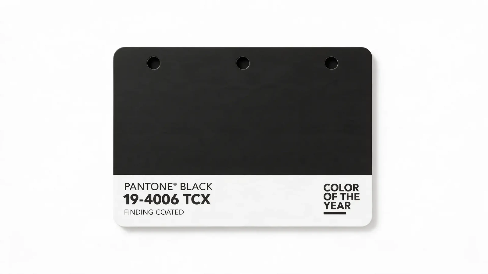
Black Friday is a perfectly good name until a designer opens the file.
Then it becomes #000000 Friday.
Then someone leans towards the screen and says, “It’s quite dark.”
And suddenly the biggest sale of the year needs a colour workshop.
You can see how this happens. The brief says Black Friday. The designer supplies black. Everyone looks at it for eleven seconds before deciding it could use a bit of warmth. Perhaps a touch of blue. Something with depth. Something that says “half-price air fryer” without seeming so aggressive about the air fryer’s past.
An extremely dark shade of navy blue Friday. Now there’s a promotion you could introduce to your parents.
Navy has a steady job. Navy understands the household budget. Navy will explain that the second television is an investment, then ask whether delivery is included.
Black Friday shouts across the shopping centre. Very Dark Navy Friday books a consultation.
The discounts would have to behave differently. You couldn’t slap “EVERYTHING MUST GO” across a tasteful navy background and expect it to sit comfortably. Navy would prefer “A considered reduction across selected pieces”.
Which pieces? The extension cords, mostly. But they’ve been considered.
At checkout, nobody would panic-buy. They would acquire. You’d leave with a toaster and the unsettling feeling that you should have worn a jacket.
Then purple asks for a turn.
Very Dark Purple Friday sounds like a sale that has been to therapy and started a candle business. You’re still buying a vacuum cleaner, but now it’s part of your journey.
The ordinary price was R2,999. Your aligned price is R1,799.
Please enter your email to receive abundance.
Purple makes the whole transaction feel mysterious. Is this a discount? An invitation? Will there be velvet? You go in for a kettle and emerge wondering whether you’ve joined something.
The loyalty programme is now an inner circle. The shopping basket is a vessel. The customer service desk has been renamed “a space to be heard”, although you still need your receipt.
Meanwhile, the designer is trying to choose between two purples that appear identical to everyone else.
“This one is a little warmer.”
“Can we see them side by side?”
They have been side by side for twenty minutes.
This is the particular challenge of selling things through design. You’re making something people must notice, understand and act on, while also having quite strong feelings about the gap between the price and the percent sign.
A good designer can care about both. Sometimes, though, the team gets so absorbed in the mood of the background that nobody notices the offer reads “up to” in the verbal equivalent of a whisper.
By the time the customer finds the actual discount, they’ve qualified as a junior investigator.
Perhaps the colour debate is a way of coping. Once you’ve placed a giant red SALE sticker on something, there’s a small part of you that wants to bring one beautiful decision back into the room.
You can’t change the price. You can’t change the stock. You can, however, make that background a very sophisticated ink blue.
You zoom in. You adjust it. For a moment, you feel in charge again.
Then the client asks for the editable file. If that sentence has made your shoulders rise, our Word article about changing one little thing will feel familiar.
The practical solution is almost embarrassingly simple. Before discussing which shade of darkness best expresses the brand’s emotional maturity, agree on what’s on offer. Make the price readable. Give the dates room. Check the smallest version somebody will actually see.
Our Word article about the button that needed a bigger house has a similar concern. Important words deserve enough space to do their jobs, even when the background is having a very good day.
And keep a little room for pleasure. A sale can be clear and still look like someone enjoyed making it. Maybe the navy is lovely. Maybe the purple gives the campaign a personality people remember. Let the colour earn its place by helping the work.
If your agency can negotiate a discount banner and a palette discussion before lunch, list your agency on CreH8ive. There are people out there who need precisely that combination of patience and taste.
As for the name, Black Friday will probably survive the feedback.
We’ll just make the black slightly blue.
Nobody will notice.
The designer will know.
Keep reading
Can You Send the File So We Can Change One Little Thing
A client wants to change one little thing. A useful design handover starts with a simpler template, clear labels and a chance to try the update together.
Al Chapo Tshabalala — 4 min

Let the Junior Present the Idea They Actually Had
The junior designer made the campaign and the presentation, and even found the cable. Letting him explain the idea—with an experienced colleague beside him—is a practical way to share credit and build confidence.
Al Chapo Tshabalala — 4 min
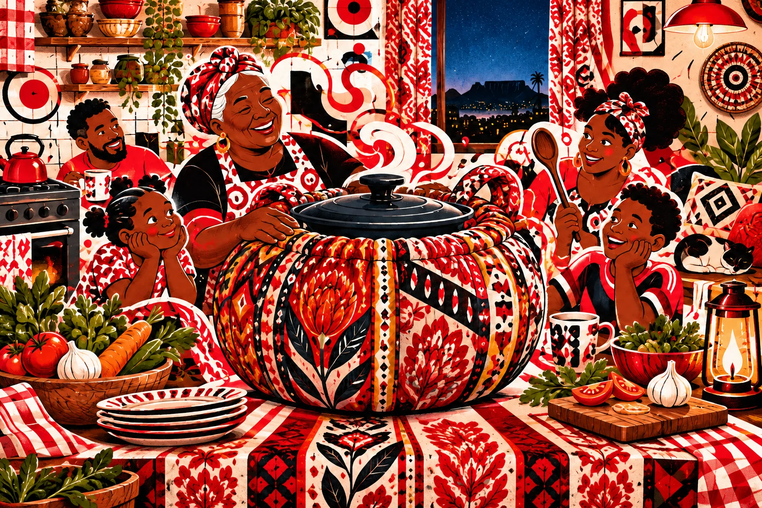
Wonderbag and the South African Art of Keeping Dinner Going
A grandmother’s energy-saving trick, a few cushions and the 2008 power cuts led to the Wonderbag — a reminder that an ordinary, improvised idea can become a real product.
Al Chapo Tshabalala — 4 min