Your Trendy Rebrand Is About to Meet the Family WhatsApp Group (and It’s Going to Be Okay)
Picture this: you’ve just unveiled your beautiful new brand identity to a South African family WhatsApp group. You’ve spent weeks on the typography. Then your aunt asks whether the pale green button means the business is closed.
Al Chapo Tshabalala — 5 min
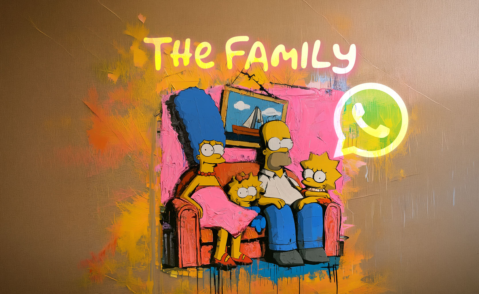
Picture this: you’ve just unveiled your beautiful new brand identity to a South African family WhatsApp group. You’ve spent weeks on the typography. Then your aunt asks whether the pale green button means the business is closed.
Your cousin sends a thumbs-up. Whether he opened the image is anyone’s guess, but we appreciate the enthusiasm!
Take a breath, because here’s the good news: this is the best test your design will ever get.
A design can look magnificent on a studio screen and still wobble when it meets a small phone, a hurried shopper or someone whose reading glasses are in the car. That’s not a failure, just useful information. So before anyone announces that the whole company is now “liquid chrome,” here are a few trends worth talking about, and how to help them shine in the real world.
The letters have found their personality
In its 2026 design outlook, South African agency SWM Communications highlights custom lettering and more expressive typography. That’s one practice’s prediction, not a national instruction to inflate every vowel, but there’s a lovely opportunity in it. Lettering can do far more than hold the words while the photograph takes the applause.
Nando’s is a wonderful local example, and it’s far from a new discovery for this year’s trend deck. The brand credits artist Marks Salimu and traditional South African sign writing as influences behind its font. There’s a real person and a proud design tradition in that story, which beats “we found a distressed font at midnight” every time.
So here’s the takeaway, and it’s a happy one: look closely at where an identity comes from. Commission the lettering. Understand its references. Pay the people whose skill makes it distinctive. Everyone wins.
Then give it a friendly stress test with your longest real product name. An alphabet that looks gorgeous spelling VIBE might need a gentle chat when it meets REFRIGERATION SERVICES.
Minimalism is lovely, as long as it still tells you something
SWM’s outlook also talks about restrained layouts, warm neutrals and clearer content blocks, and there’s plenty to love about letting information breathe. A menu shouldn’t demand the concentration usually saved for reversing a trailer.
The only catch is that simplicity can drift into a quiet competition to remove useful things.
Imagine a café that swaps its menu for six tiny words on a cream card. The designer calls it confident. A customer asks which one is breakfast. A staff member explains the whole menu out loud, which is charming right up until the queue reaches the pavement.
The sweet spot is a calmer layout that makes the important stuff easier to find. Keep enough contrast to read it. Give the price a sensible home. If the “Order” button needs a guided tour, the negative space has started hiding the good bits.
None of this is an argument against subtlety. It’s an argument for letting someone buy a sandwich without attending your brand induction.
Local character is a conversation, not a texture layer
South Africa is a place to look, listen and collaborate. It isn’t a visual treatment you can switch on at export.
There’s a big difference between learning from a sign painter’s craft and dropping an anonymous pattern behind a stock photograph. One can grow into a distinctive, lasting relationship. The other can end in a presentation where everyone says “authentic” and nobody can explain the reference.
For a different creative lens, spend some time with South African Tag Artistry. Let it spark curiosity about artists and places rather than a shopping list of things to copy.
Ask who made the work that caught your eye. Ask what the shapes, words or materials mean in their own context. Start the conversation first, before deciding that somebody else’s visual language is exactly what your new yoghurt needs.
The exciting bit still needs to work on the pack
Sunshinegun’s Nando’s grocery refresh case study describes sharper messaging hierarchy and heat levels that are easier to understand, all while keeping the brand’s expressive character.
What a great pair of ambitions! A pack can have energy and still help someone choose dinner.
Bring that spirit to whatever treatment is currently charming your studio. Give the glossy 3D element a job. Let the illustration explain something. Make sure the animation leaves enough time for the message before it cartwheels into the next frame.
And if your visual experiments have turned into an office-wide debate about machines and taste, The AI Image Apocalypse is good company. Tools can generate plenty of options, but somebody still gets to decide which one belongs to this brand, for these people. That’s the fun part, and it’s yours.
Take the design outside
Before you sign off, try the work in an ordinary situation. Read the poster from a believable distance. Open the page on a phone. Show the packaging to someone who hasn’t spent three weeks admiring the concept and ask what they think it sells.
Their answer might be worth more than another slide describing the creative territory.
Share the good stuff
Making thoughtful work with a point of view? List your agency on CreH8ive so people can find the team behind it. If you talk design on a show, put your podcast on the map too.
And for more creative observations between approvals, sign up for The CreH8ive Times.
Then send the revised design back to the family group. Your aunt can now find the button. Your cousin has replied with a photo of his lunch.
Clarity: achieved. Universal attention remains a separate brief, but you’re well on your way.
Deep breath. Kettle’s on.
Keep reading
The Quick Client Change That Became a Beautiful Reminder About Teamwork
Al Chapo Tshabalala — 5 min
Your Agency Culture Just Booked Another Workshop (And Honestly, That’s a Good Sign)
Al Chapo Tshabalala — 5 min

Top 10 Digital Marketing Agencies in Johannesburg
Al Chapo Tshabalala — 7 min