The Button That Needed a Bigger House
A translated button can reveal who a design was really made for. Give the words room, bring readers in early and test the longest version on the smallest screen.
Al Chapo Tshabalala — 4 min
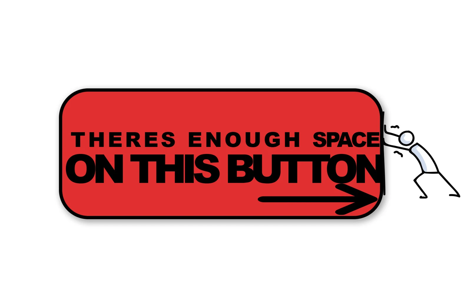
Imagine a designer presenting a beautiful little button for a community event. It says “Book now”. There’s space on either side. The corners are rounded just enough to suggest that somebody has been to design school. Everyone loves it.
Then the translated copy arrives.
The button looks at the new words the way a person in a full lift looks at someone approaching with a pot plant. Technically there is room. Everybody will have to make some decisions.
That imaginary button is doing a useful thing. It’s showing the team exactly when they decided who the design was for. They decided on Tuesday, when they approved the English version and called the layout finished.
Give the words somewhere to go
The World Wide Web Consortium’s guide to text size in translation explains why short bits of text can change length considerably when translated. Its advice includes letting text reflow and avoiding small fixed-width containers. A button can grow. A card can get taller. A heading can have another line without anyone needing to hold a memorial for the original grid.
That’s easy to agree with until the layout is on screen and someone says, “Could we just take the font down a bit?”
We could. We could also invite people to a braai and give the late arrivals teaspoons. They’ll manage. They’ll remember.
Try asking the translator what a reader needs to understand before asking what can be cut. On an event page, for instance, the difference between reserving a place and buying a ticket matters. If two versions of a button make different promises, you’ve got two booking processes in the reader’s head, even if there’s only one behind the screen.
Bring the right people in while the chairs still move
Imagine the same team putting together a poster as well. They’ve left room for a striking photo, a generous headline and three small lines of practical details. A colleague who speaks one of the languages in the brief points out that the shortest translation of the headline sounds like an instruction from the municipality. The event is a Saturday dance workshop.
That colleague has spotted a creative problem. Give them ten minutes with the writer and the organiser. The organiser can explain what a first-timer is likely to worry about. The writer can offer a simpler thought. The translator can find a way of saying it that feels like somebody opening a door.
This is also where a real reader earns their cup of tea. Show them the poster and ask where they’d go, when they’d arrive and what they’d bring. A yes to “Do you understand it?” can mean anything from genuine clarity to “I can see you’re trying and I’d like to go home now.”
If you’ve ever defended a perfect layout in a presentation, picture what happens when it leaves the room and meets the family WhatsApp group. Your carefully aligned poster might turn up as a screenshot on a phone held at arm’s length. The person reading it has every right to find the date before they admire the typography.
Put the longest version on the smallest screen
Early in the job, pick a real headline, a real button and one piece of information somebody could get wrong. Use actual translations, then look at them on the smallest screen you expect your audience to use. For print, make a copy at the intended size. If somebody has to pinch, squint or hold the thing at the distance used to read the electricity meter, change the layout while it’s still cheap.
You might find that the English version gets better in the process. A team that has to explain “secure your spot” in several ways might discover that “book a place” is clearer for everyone. The nicest part is hearing a designer say, “That actually works better,” with the mild surprise of someone who took a different road home and found a bakery.
If this is the kind of work your team does, list your agency on CreH8ive and tell people how you make room for the readers you’re trying to reach. For another look at how creative work gets better when we get specific about who it’s for, read When the Client Says Everyone Is the Audience, Bring an Extra Chair. And if the button needs a bigger house, give it one. You’ve already paid for the screen.
Keep reading
Advertising Wars: Coke, Pepsi and the Day KFC Fixed a Big Mac
From Pepsi borrowing Coke’s polar bear to KFC fixing a Chicken Big Mac, the best advertising comebacks give us more than a punchline.
Al Chapo Tshabalala — 4 min
Who Made the Ad and Why Is Their Name Missing
A good credit gives somebody’s work a name—and shows the rest of us how an advertising film worth watching actually got made.
Al Chapo Tshabalala — 4 min
Choosing an Agency Is Like Voting, Except You Can Ask Who’s Doing the Work
An agency pitch is a campaign. The working relationship starts after the votes are counted — so ask who will actually be doing the work.
Al Chapo Tshabalala — 5 min